Friday, 11 November 2011
Main Task: Post Production Feedback
Strength
The audience liked the lay out, design and colour scheme of my front cover and they said that it was really effective. To be more specific, they believed that the colour scheme is really good and they liked my layout. They said that it was really easy to identify the genre of my Music magazine. The Photo is really effective and is at a High Quality and look professional.Weakness
I didn't receive a lot of constructive criticism, because there wasn't enough people Looking at it and gave me constructive criticism, but they said that it was a little hard to read and i need to change my fonts on my Double spread.
Main Task: Case Study of a publishing House
CONDE NAST
The publishing house that I will be studying will be CONDE NAST digital.
I will be looking at these areas of the company:
· What magazines do they publish?
· What type of Audiences is targeted by these Magazines?
· Why would it target different audiences with each magazine that it makes?
· Does the company have any other business interests?
The CONDE NAST will target different audiences because everyone has different types of magazines which they like i.e. me I would read a music magazine because that’s what teenagers mostly care about. I think that 1 magazine can’t hold everything that people want. Condé Nast DigitalUK's stable of websites now attracts over 2.6 million unique users with 46 million pages viewed each month; 250,000 people have requested to receive emails from us on a daily and weekly basis; and over 200,000 unique users currently access our content on mobile phones, generating more than 3.7 million page impressions per month.
Condé Nast was one of the first British publishers on the Internet and has carved itself a reputation for being among the very best. The Interactive division launched ahead of the pack in 1995, with daily-updated websites for Vogue and GQ. As more sites followed - including those accompanying the company's newest magazines (CNTraveller.com in 1997, Glamour.com in 2001 and EasyLivingmagazine.com and GQStyle.com in 2005) - the division become recognised for its high-quality, beautifully designed and well targeted websites, earning it lots of press attention, a fantastic relationship with advertisers and many awards along the way. It has also led the vanguard in mobile services in the new millennium.
Main Task: Profiling Your Audience
The Typical ***** Reader: Jamal Hendricks Aged 22, his a big fan of Hip Hop/R&B. He is a very passionate musician. Jamal is very open to all genres. He is very up to date with fashion as you can see in the picture to your left. He mustly wears a cap, jumper and designer jeans. When he was young he had a role model in the Hip Hop/R&B sector in the music industry. He was involved in music since the age of 8. He is a music idol and his music fan follow him on social networks such as Facebook and Twitter. The 22 year old is currently in a full time education which he is studying Music Technology. He is a very social person which makes friends very easy due to the way his family brought him up.
Main Task: Audience Research
Considering all the answers collected from my audience i had asked questions which could help me evaluate my Music magazine piece.
A Large amount of people suggested that the best name for my HipHop/Rap music magazine would be "Undergroud" and because of my Results that why I named it Underground.
I will also Feature a price for my music magazie as i also got results on how much it should be sold at. The majority of people said '£1.00 - £2.00' and that why i Priced my magazine £1.50 because its inbetween the average.
Questions
1. Out of the following names for my magazine which one do you think best suits my music magazine?
- Shine
- Underground
- Fame
- Beats
- Grime
2. As my music magazine has the theme HipHop/Rap, what colour do you think would be the appropiate colour scheme to go with it?
Blue
White
Black
Grey
Red
3. Who much would you buy a HipHop music magazine?
£1.00
£1.49
£2.00
£2.49
£3.00
£3.49
Main Task: Double page spread texual analysis
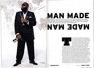
Colour scheme: The magazine double page spread (DPS) consists of plain colours which makes the person stand out, creating a modern and contemporary.
Image: Generally DPS consist of a large image which covers whole of the first page. The pose of the subject is dominant because his legs are shoulder width apart to show importance. Occasionally the image will bleed between pages but this one does not. The image is put separately on to one page and text on to the other.
Subject Name: The subjects name will be amongst the text on the next page and it will be highlighted.
Character: The double page spread show us a picture of a successful artist called “Rick Ross”.
Costume: The costume that the artist is wearing in this image is a suit. The colour of the suit it black that connotes power and respects.
Props: The artist is wearing a ring in the picture, this can connote that he is very interested in fashion. This can also tell us that he may have money due to the size of the ring.
NVC (Non-verbal communication): looking at the way that the man is standing telling us that he is dominant person in the music industry, his legs are shoulder weight apart to show importance and power.
Target Audience: The target audience for this type of double page spread would be for the age 15-25. I choose 15-25 because of the colour and the language that they are using in the magazine.
Colour scheme: Magazine double page spread (DPS) will follow a simple colour scheme, that means that the colours that the magazine double page spread uses there colours to minimum, creating a modern and contemporary look.
Image: Generally Double page spread consists of one large image taking up a whole page but in this magazine the picture takes up ¾ of the magazine (DPS), occasionally the image will bleed between page(part of the image is on the other side of the magazine).
Subject Name: Somewhere amongst the double page spread layout, the artist name will be and also will be highlighted, in this magazine the artists name is “THE GAME”.
Props: He is wearing a big chain connotes that he is very interested in fashion. He is also wearing a gold watch which tells us that he may have money due to his appearance.
Costume: The costume that the artist is wearing in the images is a T-Shirt, dark blue jeans and Nike trainers.
Target Audience: The target audience for this type of double page spread would be 16-25.
Main Task: Introduction
My name is Omer Mohamed and I am Taking AS Media, in this Course I will be Creating a Music Magazine front cover, Content page and Double page Spread for the final product. During this course my work will be revolving around the genre HipHop/Rap. I will also do planning and research which will be involving Audience Research, MoodBoard and Magazine Convention Diagrams.
Main Task: Front cover texual analysis
Denotation:
The magazine cover consists of a colour photograph of a man looking directly towards the camera. It is a median long shot showing his head, body, arms and waist. He is standing up straight; his legs are shoulder width apart. The background of the photograph consists of burnt cars and fire, the background covers the whole of the magazine. Behind the man’s head there is the “VIBE” Masthead. In front of him there are six separate cover-line in yellow and white. The photographed mans name is in yellow. The barcode is visible in the bottom left hand corner.
Masthead:
VIBE masthead is very unique: White with bold lettering the font used is a serif font. The masthead of this magazine is very famous and it has all different artists every week on the front cover. The masthead of this magazine is very big and it goes behind the man’s head and body. The name “VIBE” tells the audience that the magazine is music based.
Denotation:
The magazine cover consists of a colour photograph of 2 men and a women looking directly at the camera. It is a medium long shot showing his head, shoulders and arms. They are standing but his bottom section of his body is not visible. The background is a light and dark combination of grey and black, and the photograph covers the whole of the magazine cover. Behind the man is the “VIBE” Masthead, and in front of him are 4 separate cover-lines in white and Red. The photographed people name is in black and red there are red + beneath one of the cover-lines. A barcode is visible in the bottom left hand corner.
Masthead:
“VIBE” masthead is very distinctive: white. The font used is sans font. The font is used in all of the “VIBE” magazines. The word “VIBE” is very famous and popular; this magazine mostly photographed music artists. The Masthead is the biggest word on the magazine, and the word “VIBE” mean beats and music. The masthead tells the audience that the magazine is music based.
Characters:
The people photographed are one of the best musical rapper/singers ’Rick Ross, P Diddy and Janelle Monae.
Composition:
They are posed in a very suggestive ‘dominate’ kind of way. They pose, body language, and clothing, are very business like.
Costume:
They are smartly dressed and they are wearing suits and they are not showing any cleavage. There costume is been specifically chosen for them people because in society they belong in the upper class and the upper class wears suits, ties and shirts.
NVC: There Non verbal communication is very serious. There looking directly at the camera to connect with the audience.
Setting: There is little setting; however the black and grey background makes the people stand out.
Subscribe to:
Comments (Atom)


